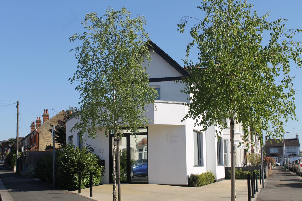


The existing building was historically a purpose built convenience store to serve the local community; this use had ceased and was operating as a commercial office at the time we purchased the property. The large triangular site at the front of the building was underused and as architects, we had a vision of creating a contemporary open plan work space as the existing Victorian form of smaller rooms was not suited to a studio environment.
The design of the extension responds to the triangular site with a chamfered main entrance and canopy, the building splays on one side and the addition a contemporary bay on the opposite side responds to the chamfered bay of the original building.
The triple aspect design provides a 180 degree outlook around the site and creates a light filled work space. The chamfered window reveals add architectural interest to an otherwise minimal white rendered facade and provides a harmonious relationship with the attached period building.
The new landscaping around the site including Silver Birch trees, box and laurel hedging has created a dramatic addition to street scene.